Wish
Careers

Status
Concept
Timeline
Jun 2018 – Aug 2018
Type
Enhancement
My Role
Co Designer + Researcher
Prod-dev process
N/A (non-sprinted design work)
Deliverables
Design concepts
Contributors
Alex Zandi (Design)
Jan Sundar (Design Manager)
Shan Shen (Partner/Mentor)
.Wish is a global e-commerce platform that brings products to customers directly from manufacturers at crazy low prices. Since its inception in 2011, the company has grown into a unicorn startup after becoming the #1 shopping app in 40 countries on the Google Play store and in 20 countries on the App Store.
With a customer base of 500 million+, Wish focuses on the underserved market of online buyers who worry less about the brand and more about the cost and value of the product.
In the summer of 2018, I worked with Wish as a Product Design Intern on the Merchant Platform Team. The redesign of Wish Careers was a side project I worked on with my fellow intern Alex Zandi during my tenure.
The Wish Careers website is the go-to location for job seekers who are interested in working with Wish. Job openings are posted on the Wish Careers site via Lever, a third-party service used by the recruiters to manage job openings and applications.
In addition to a list of open roles, the website also provides information about the company’s business, teams in the organization and employee benefits.
Clicking on a job opening, however, redirects the user to Wish’s portal on Lever where additional details about the roles can be found and the candidate can actually apply. Since candidate and job related data resides within Lever, the website is mostly static and does not rely on a database to pull data avoidance of certain acts, delivery of products/services, payment considerations etc.
First Impressions
Although, a careers site might come across as a place to search and apply for job openings, it also doubles up as the face of the company which communicates information about its business and values to the world outside. Our first impressions therefore, had plenty of unanswered questions:
We had gathered a lot of questions but the goals of the redesign were yet to be defined. We hadn’t scoped the problems to tackle yet, so learning as we go was the only way forward. Being a side project, resources weren’t assigned right off the bat.
This meant that we did not have the luxury of collaborating with subject matter experts, content writers or developers and had to be prepared to wear multiple hats between the two of us as we approached the redesign.
In a scenario like this, the Lean UX model seemed like an appropriate way to go forward. The ‘Build – Measure – Learn’ philosophy guided us to ‘Prototype – Critique – Reform’ our designs.
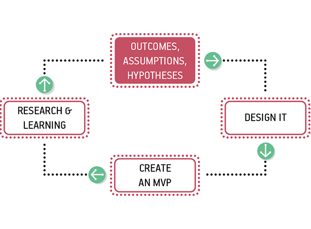
Lean UX process by Jeff Gothelf
To pin down the pain points with the existing site and further refine the problem statements, it was imperative to understand the needs and expectations of the stakeholders. We identified job-seeking candidates and recruiters as the primary stakeholders. These people were also the obvious end-users of the Wish Careers website, with the recruiters being responsible for updating data and putting up openings on the site.
Next, we had to decide the methods for data collection. With recruiters available at the office, in person interviews seemed like the best way to collect qualitative data to gather pain points. For the job-seeking candidates, we decided to conduct a public survey, hoping to gather responses from a representative sample which would include people coming from different backgrounds and with varying level of experience.
Data Collection – Recruiter Interviews
The objectives of recruiter interviews were:
We conducted 4 semi-structured interviews, about 30-60 min long, which included 6 Recruiters and 1 HR in total. The questions were open ended and varied a little based on the experience and job role of the interviewee. Some of the general questions, we asked every interviewee were:
Data Collection – Candidate Survey
The objectives of recruiter interviews were:
We compiled a survey using Google Forms consisting of mostly multiple choice questions with a few open questions at the end, asking respondents about an ‘ideal job search experience’. Respondents were also asked about the top companies they would like to work at so that we could look into the career sites of those companies for a competitive audit. The questions in the beginning collected demographic information, while the rest of the sections were mainly focused on the content that was important to job-seeking candidates before choosing a company, accepting an offer or learning in general.
The survey was initially released to the public on LinkedIn and then it was made available to Wish employees and interns. The common themes that emerged from the survey trends were centered around ‘Life and Culture’, ‘Pay and Benefits’ and the ‘Learning experience’.
Now, that we had heard the voice of our our stakeholders and assimilated data from the interviews and the survey, the next step was to use all those learnings to redefine our goals and call out what needed immediate attention. Some of the key pain points we discovered were:
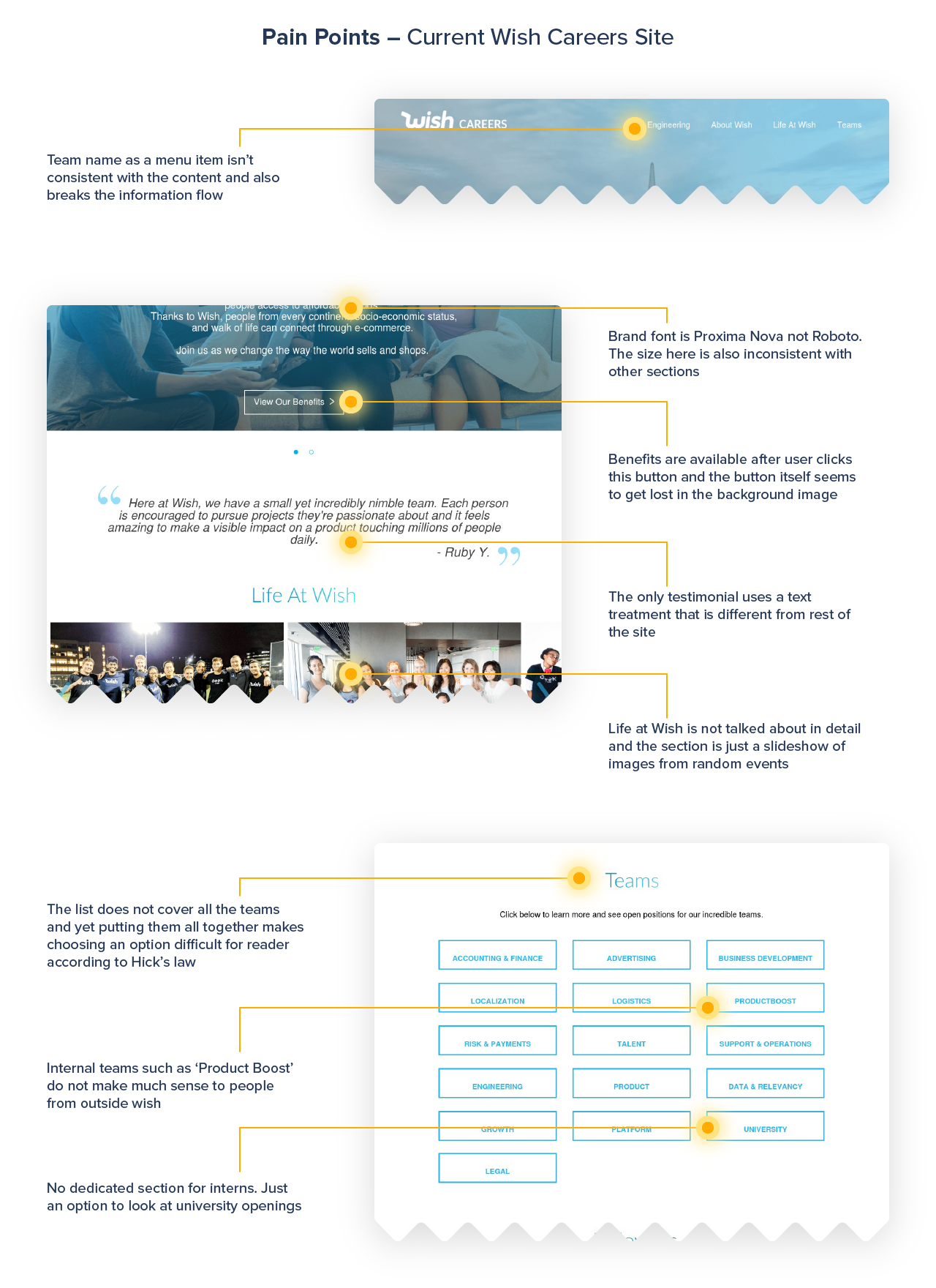
We looked at the current Wish Careers site and determined that it was not just the content that was a problem. Based on the needs and expectation of our stakeholders and the newly discovered pain points, it seemed like plenty of things were out of place(images below) which could have severely impacted Wish's brand perception and its ability to attract great talent. We observed that:
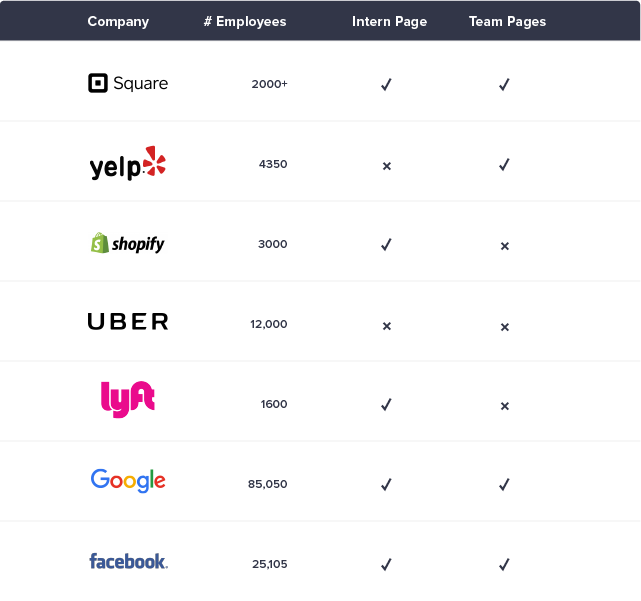
Before going to the drawing board and scribbling ideas, we conducted a competitive audit to validate some of the findings from our research and see how Wish’s direct and indirect competitors addressed it. In addition, it also helped us conceptualize and ideate on the information architecture, layout and content for the redesign.We looked at the career sites of Shopify, Yelp, Uber, Lyft, Square, Facebook and Google to see the important sections and the flow of content. Since we did not have an organized team structure, we had to make a decision on having team pages and defining higher levels by area of expertise rather than a specific function within the company.
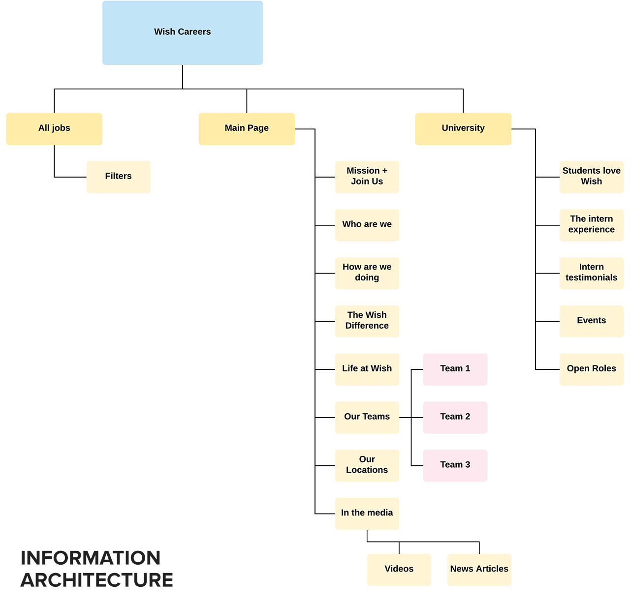
Information Architecture
Site-map was the first step to redesign. Taking cues from the data we had collected from research, we began planning the sections and the pages that would contain them. There was a series of discussions on minimizing the the number of entries in the navigation menu and on simplifying the website structure.In the first few iterations of the IA, there were pages dedicated to ‘Life at Wish’ and ‘Community’, which were later decided to be included as sections on the ‘Main Page’. This helped us keep the navigation bar simple and direct. We also pondered over a page titled ‘Explore’ that would consist of the company’s story and history but it was decided to eliminate it since that information wasn’t relevant to candidates applying for jobs, nor did we see any demand for it in our survey.Finally, we agreed over a site-map in the 7th iteration (image below) that was considered good to go ahead with.
Sketches
Although we had agreed upon a site-map, it was open to change as we learned on the go and received critiques. With a basic structure in place, it was time to put pen on paper and explore some layouts for putting together the website. We started out with sketching rough ideas, converting some of them to low-fidelity wireframes.
Drawing from the ‘Diverge and Converge’ philosophy, this was the phase when we diverged and explored all ideas that knocked at the doors of our brains. We took a few of this explorations to the next step where we added the little more fidelity and realized the layout and information hierarchy.
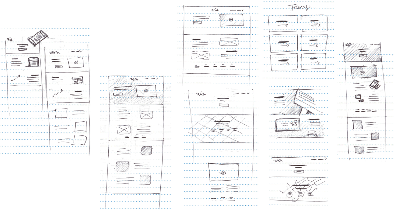
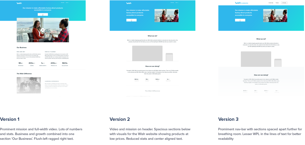
First Iteration
As we were moving from sketches to mocks, planning to infuse one of the company style guides, the new recruiting video was ready. This was going to be a part of the header as it summarized everything about the ‘Life at Wish’. Although, copy was still in the works, we decided to write some of our own combined with the video to produce the first iteration. Home page, being the most important (and the landing) page of the site, was naturally the first choice to design.
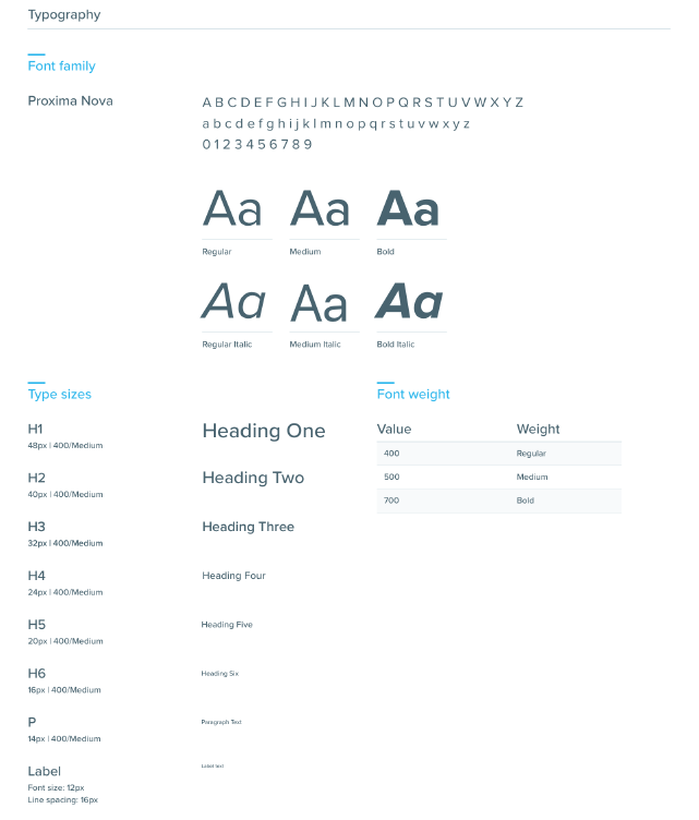
Detailing – Type, Grid Colors
An interesting challenge awaited us as we were redlining the elements on the page – The layout grid for Merchant Platform (my team) and Wish Product (Alex’s team) were different. In addition the style guides were also a little different and each had a flavor of the audience it was catering to. Platform’s colors were more enterprise focused while Product naturally had a broader range fitting the consumer market space.
Now that Wish Careers wasn’t a part of any specific team, the branding had to reflect the company as a whole. We played with different combinations in each of our iterations and later decided that we’d go for platform’s grid and typography and product’s colors. This helped the designs going forward as it added professionalism from platform’s side and playfulness from product side.
Assets, Copy and Content
Having the right copy that made a connection with the readers and putting up rich media such as professionally shot photographs and videos that reflected the life and culture at Wish was central to the success of our proposed redesign. We reached out to the creative and social media teams to collect media such as photographs of office spaces, company meeting, team outings and a recruiting video that was in the works.
We drew the assets for locations (image below) and perks from scratch as there weren’t many assets available in the libraries maintained by design teams that we could use for the careers site. We enjoyed a little creative liberty here as there wasn’t a standard illustration style and design teams often experiments with various styles for their projects.
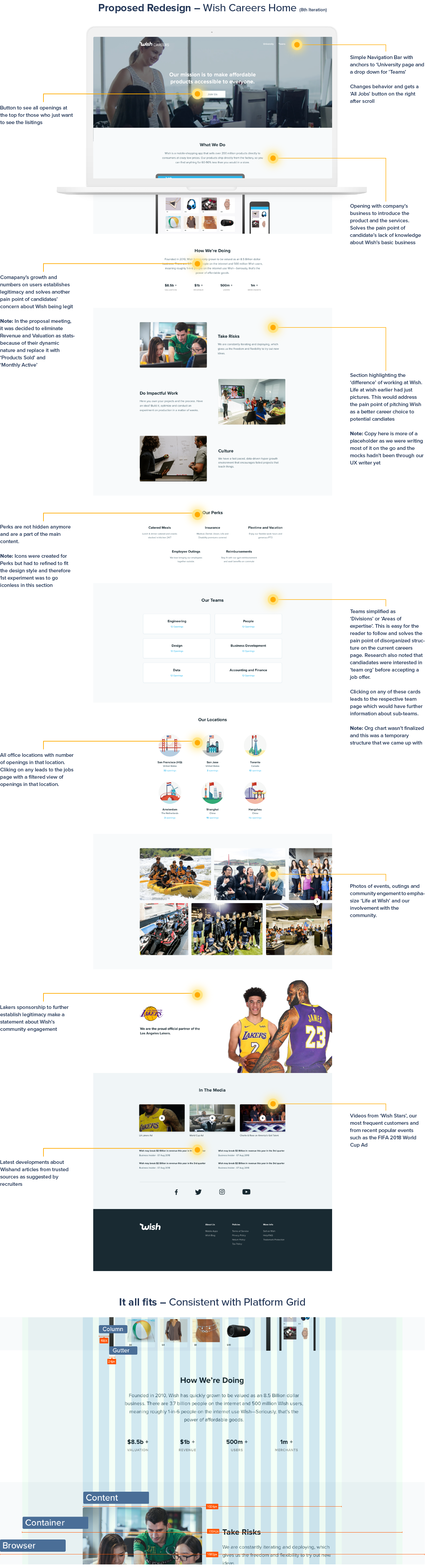
Along the way, there were many discussions before taking design decisions and we found ourselves going back and forth between iterations. It was never a linear process and feedback and critiques from other designers made our lives easier. We learned from every iteration and always went back to the previous versions to see what worked best. For instance, the video in the background gave central stage to the mission and at the same time accented it by giving it a fitting background, this was going back to the first version but improving it by eliminating space at the top and the sides which was pushing other content further down the page.
The proposed mockup was by no stretch of measure production ready. Since we were nearing the end of our internship tenure, we had to transfer knowledge about the designs to the incoming interns. There was work to be done for the actual content. Copy needed the eyes of an expert and consent from the community and HR teams. We drafted a document listing all the required next steps and handed it over to our teams.
Key Challenges
Each challenge was a journey along the course of this project and there were plenty. But some that really got us stuck were:
My contributions
How did I grow?